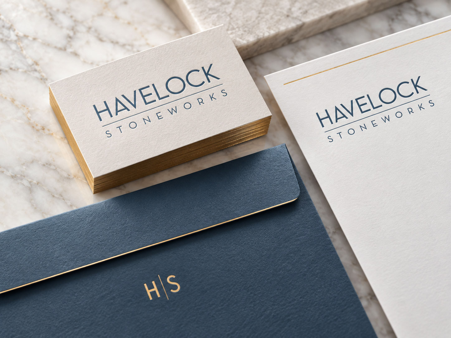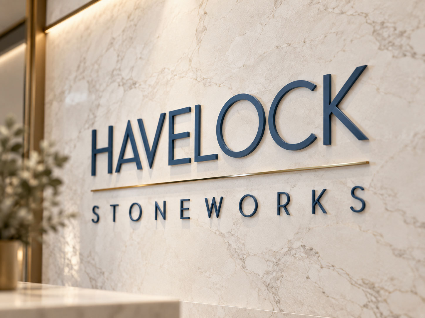
Havelock Stoneworks is an independent stone fabrication business looking for an identity that felt refined, established and premium without becoming ornate. The brief called for a simple typographic logo, a compact secondary mark that could eventually function as a physical maker’s mark, and a flexible identity that would work equally well across digital, print and fabrication applications.
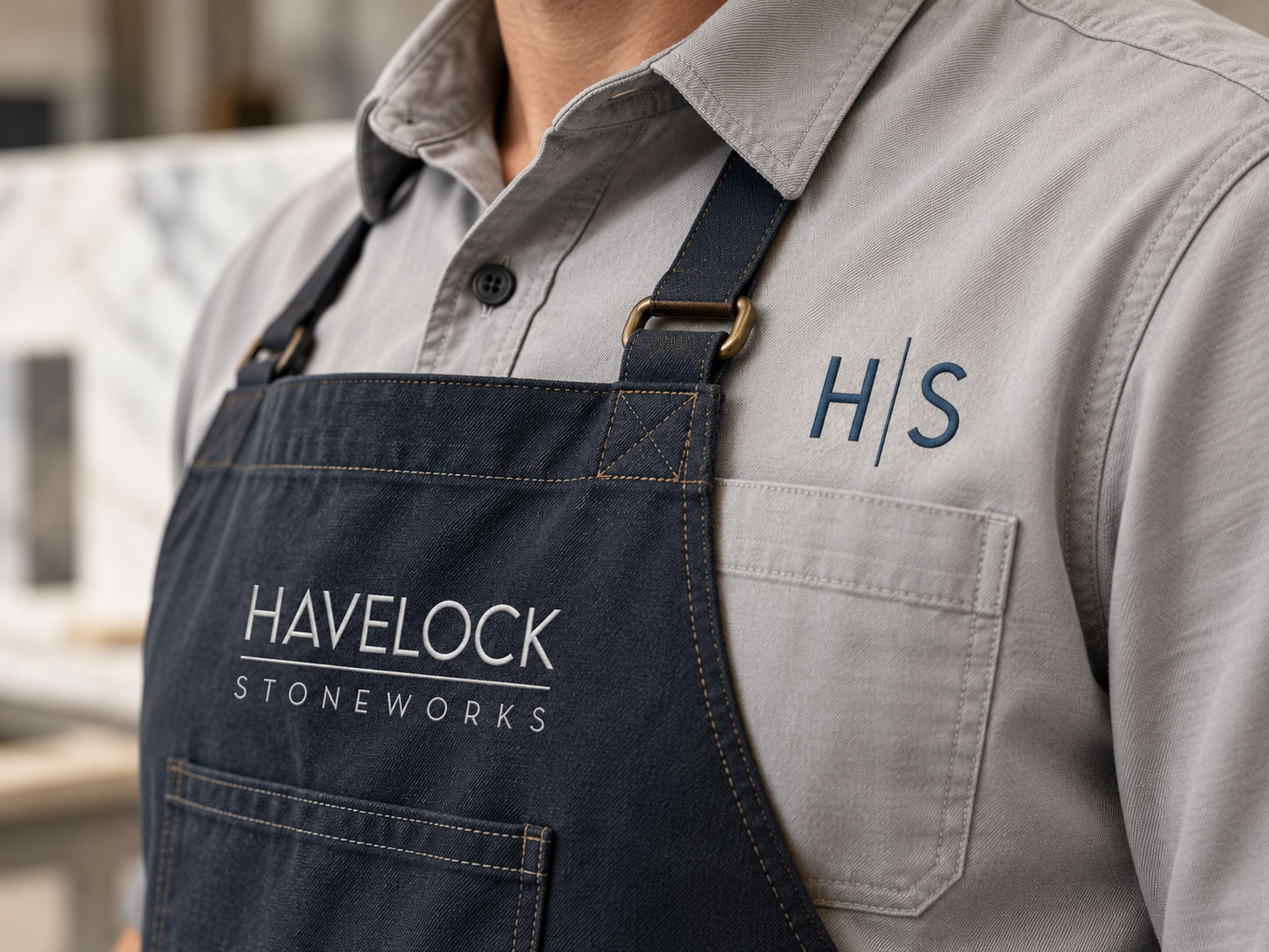
The resulting system pairs clean, architectural typography with a restrained palette of deep blue, metallic gold and stone-inspired neutrals. Supporting monograms, typography and material textures extend the identity beyond the primary logo while keeping the overall look understated and consistent.
A clean, highly legible wordmark designed to feel contemporary and precise while still carrying the permanence and craftsmanship associated with architectural stone.
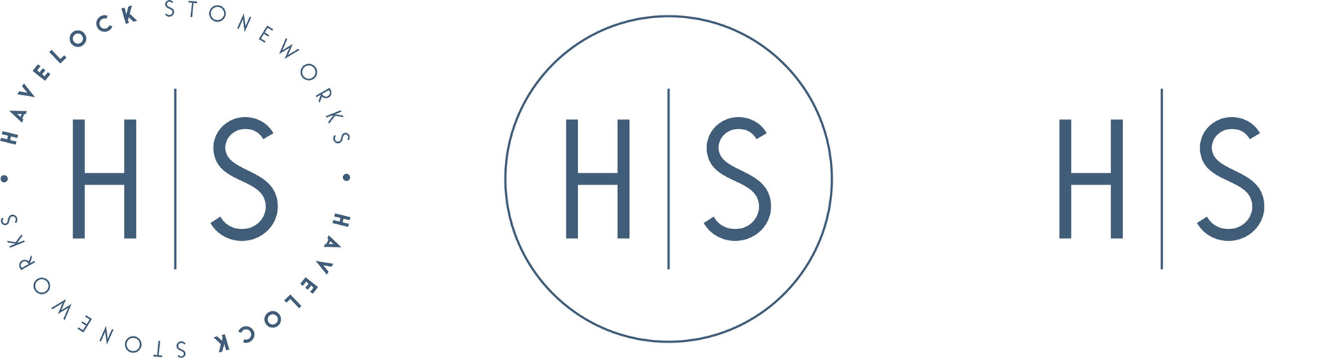
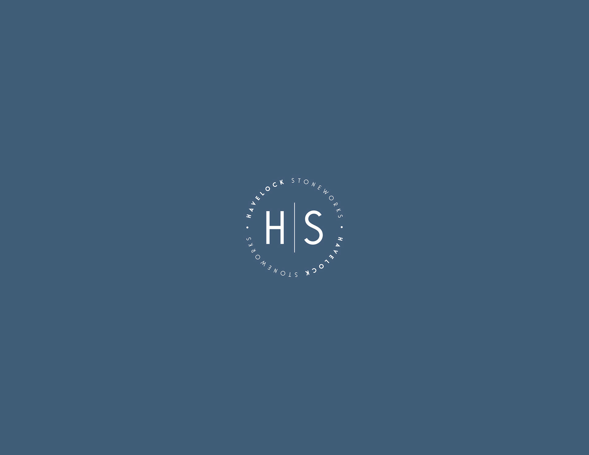
Monogram System
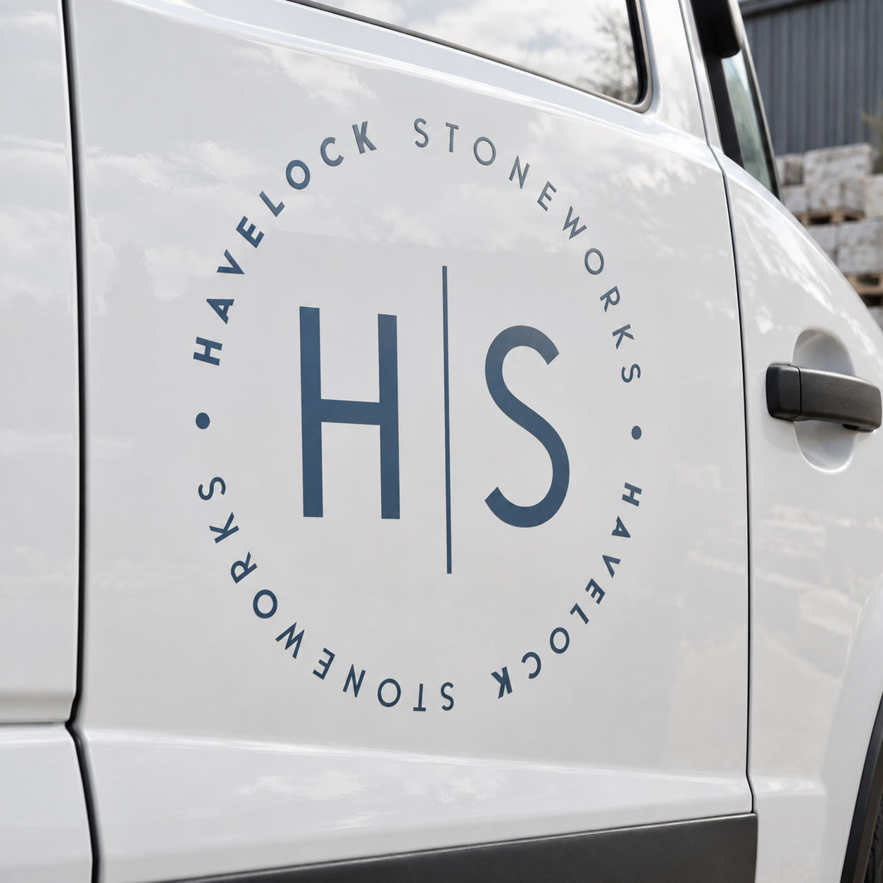
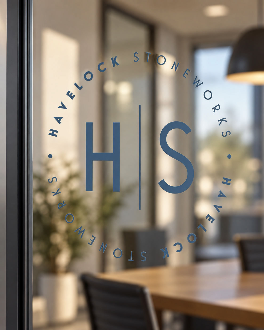
A family of compact HS marks gives the brand flexibility at smaller scales, from social icons and merchandise to potential sandblasted or inlaid maker’s marks on finished stonework. The original brief specifically anticipated the monogram being used physically on the work itself.

Colours & Textures
Havelock Blue provides the primary foundation, paired with metallic gold for a more premium expression and a quiet stone neutral for supporting applications. The palette connects naturally to the materials of the business without becoming overly literal.