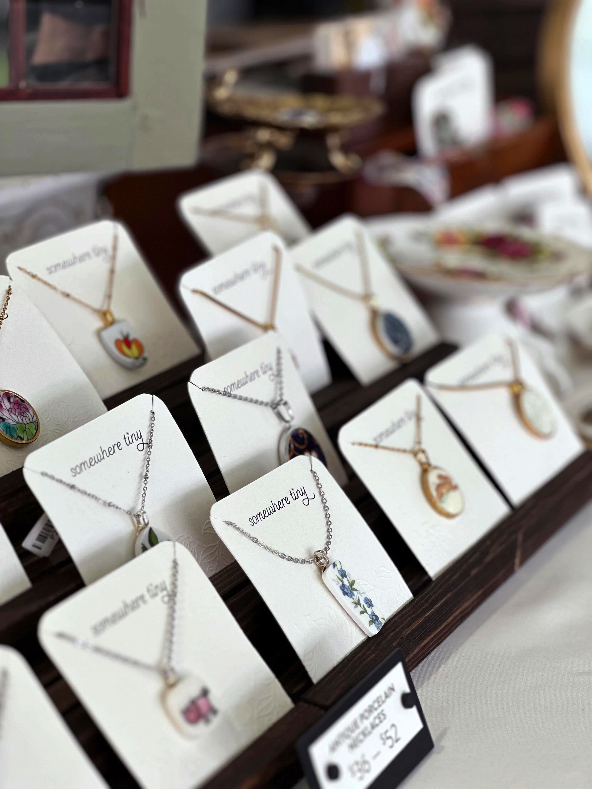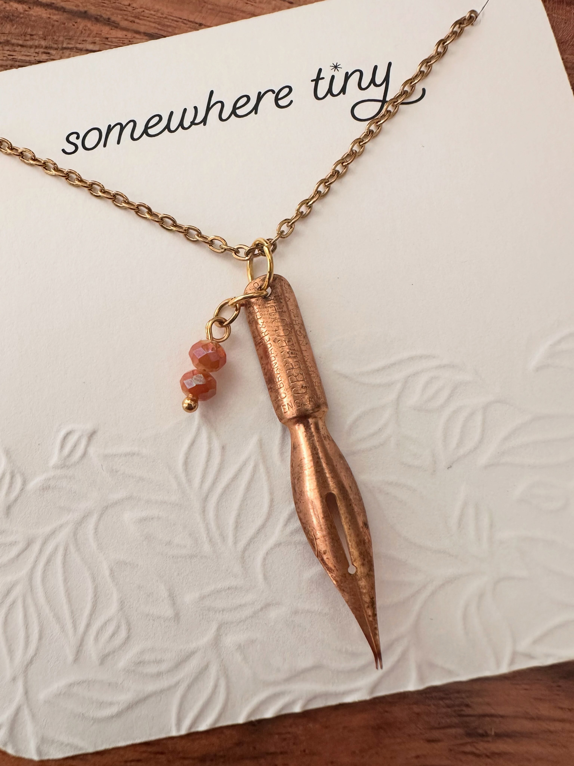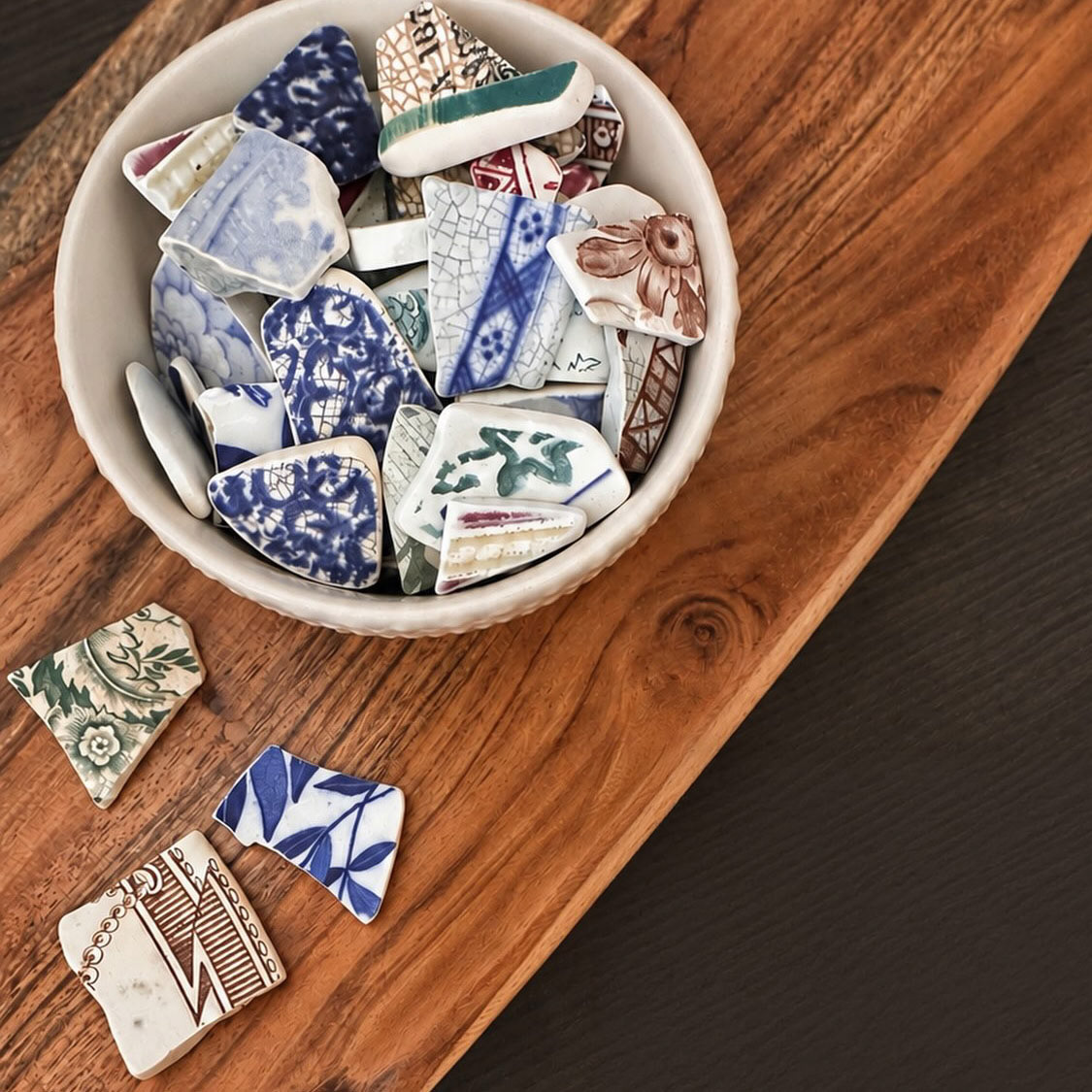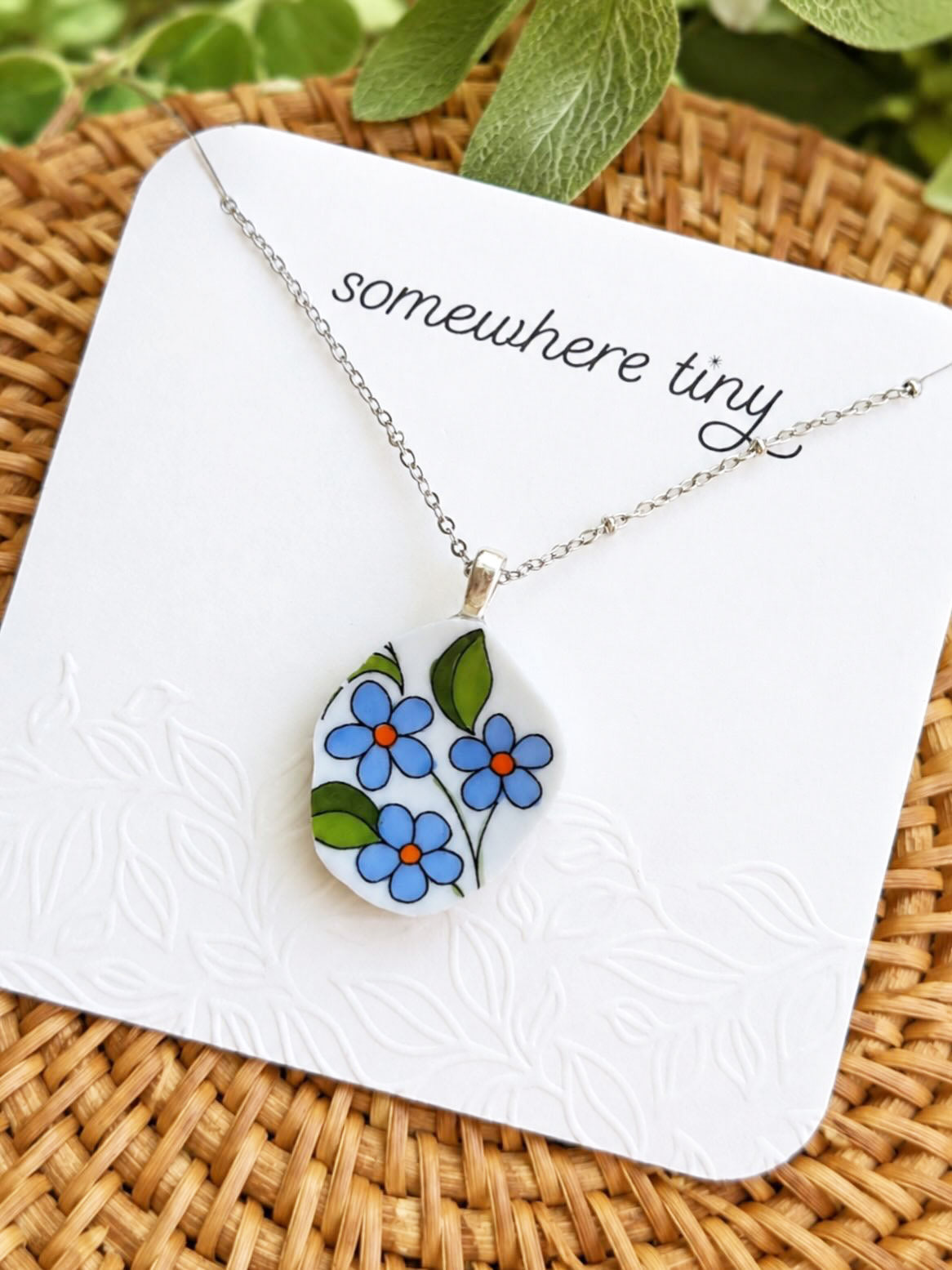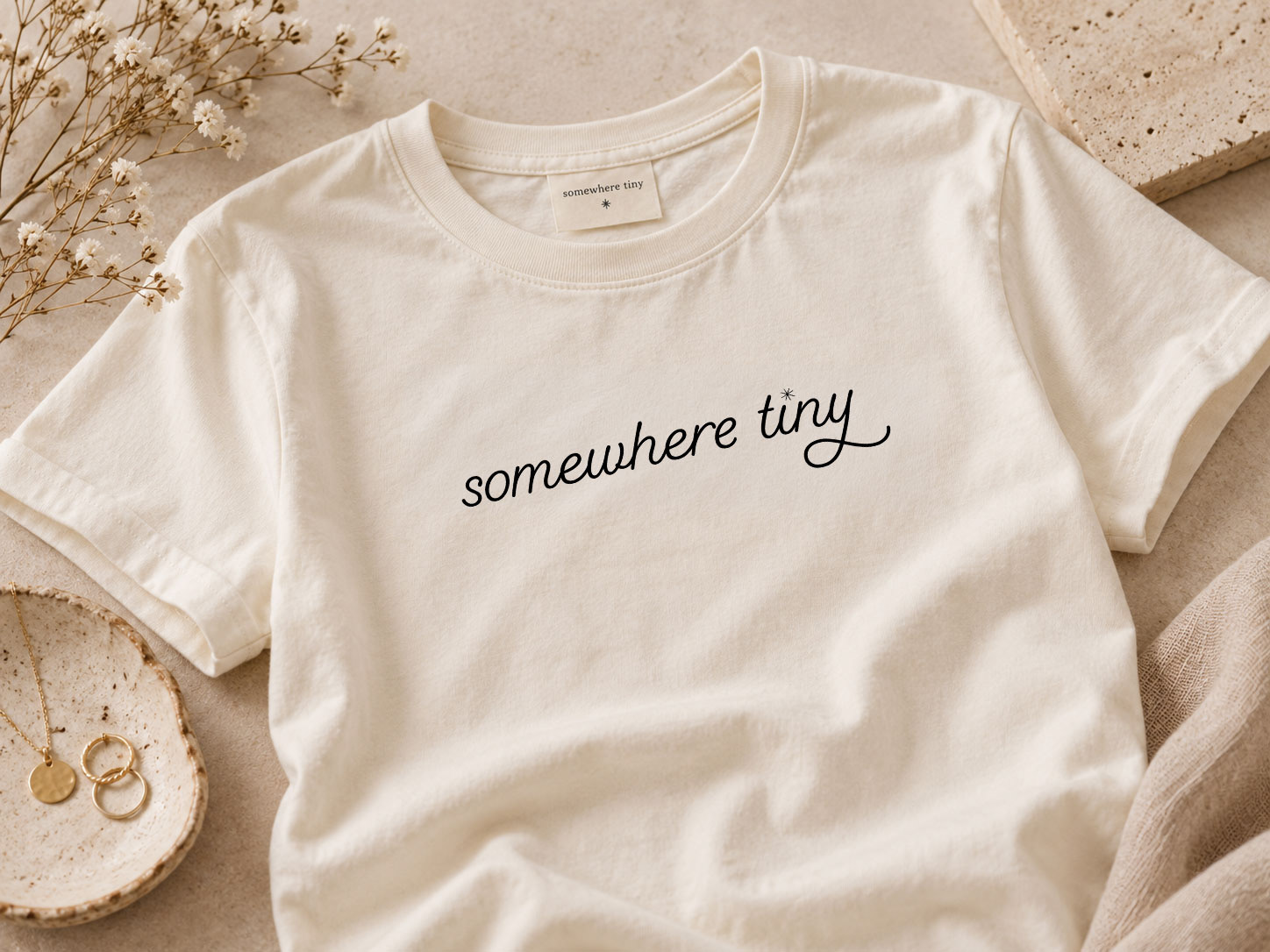
Somewhere Tiny is a jewellery brand that gives new life to fragments of broken porcelain, vintage fabrics and antique paper, transforming found and forgotten materials into one-of-a-kind pieces.
The identity was designed to reflect that balance of history and reinvention. Playful and characterful, but also highly restrained, refined and uncluttered, allowing the individuality and detail of the jewellery to remain the focus.
Wordmark
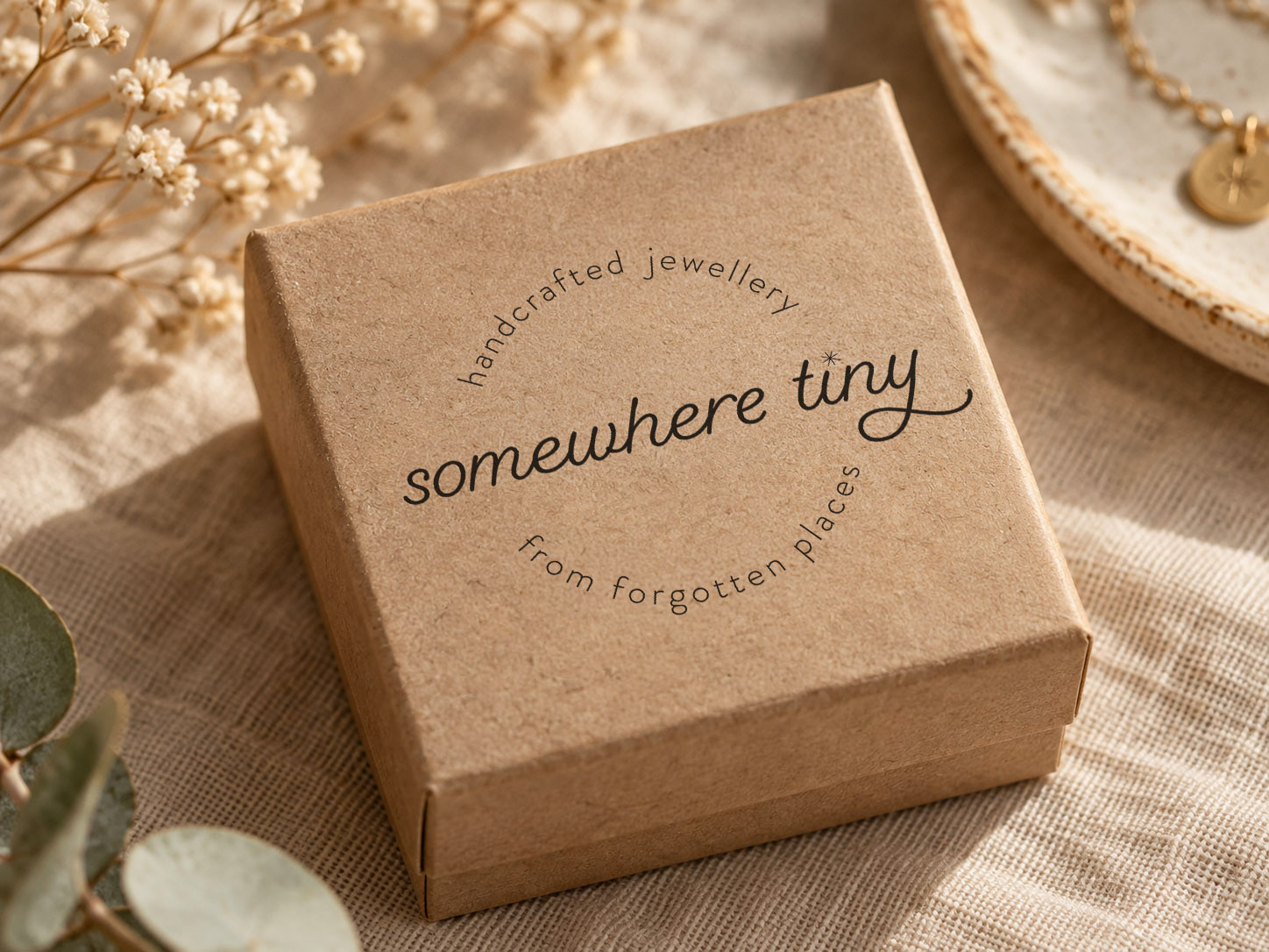
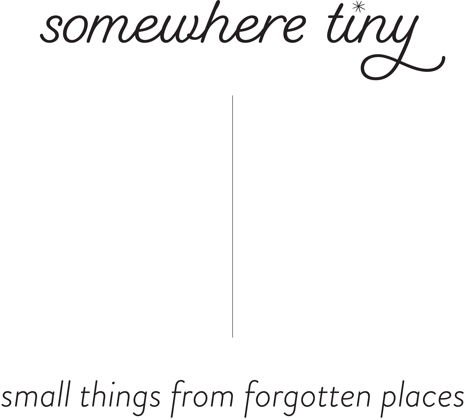
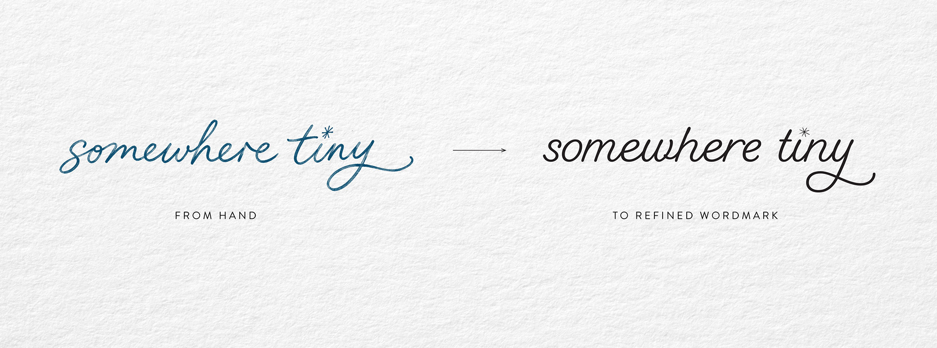
The Somewhere Tiny wordmark began with natural handwriting, capturing the personal, handmade quality of the brand. It was then carefully refined and redrawn to create a cleaner, more consistent mark while retaining the imperfections and character of something written by hand.
Colour
Black and white form the foundation of the identity, creating a quiet, timeless backdrop for the colour and detail found within the jewellery itself. A supporting palette of soft blush, sand, sage, ivory, oat and stone adds warmth and a subtle sense of heritage without competing with the work.

Brand Expression
The wider visual system is deliberately understated, combining generous white space, tactile materials and restrained typography with the more expressive wordmark. The result feels contemporary without losing the sense of nostalgia, craft and history at the heart of the brand.